Notebook for data visualization#
Different Python Libraries:
- Matplotlib: low level, provides lots of freedom
- Pandas Visualization: easy to use interface, built on Matplotlib
- Seaborn: high-level interface, great default styles
- Plotly: can create interactive plots
Matplotlib: It is a low-level library with a Matlab like interface which offers lots of freedom at the cost of having to write more code.
import matplotlib.pyplot as plt
import matplotlib
import pandas as pd
names = ['sepal_length', 'sepal_width', 'petal_length', 'petal_width', 'class']
iris = pd.read_csv("iris.csv", names=names)
iris.head()
| sepal_length | sepal_width | petal_length | petal_width | class | |
|---|---|---|---|---|---|
| 0 | 5.1 | 3.5 | 1.4 | 0.2 | Iris-setosa |
| 1 | 4.9 | 3.0 | 1.4 | 0.2 | Iris-setosa |
| 2 | 4.7 | 3.2 | 1.3 | 0.2 | Iris-setosa |
| 3 | 4.6 | 3.1 | 1.5 | 0.2 | Iris-setosa |
| 4 | 5.0 | 3.6 | 1.4 | 0.2 | Iris-setosa |
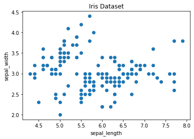
#Scatter Plot: to observe relationship between 2 variables

#ax = plt.subplots()
colors = ['red', 'green', 'blue']

# scatter the sepal_length against the sepal_width
plt.scatter(iris['sepal_length'], iris['sepal_width'])
# set a title and labels
plt.title('Iris Dataset')
plt.xlabel('sepal_length')
plt.ylabel('sepal_width')
Text(0, 0.5, 'sepal_width')
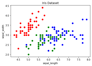
# create color dictionary
colors = {'Iris-setosa':'r', 'Iris-versicolor':'g', 'Iris-virginica':'b'}
# create a figure and axis
fig, ax = plt.subplots()
# plot each data-point
for i in range(len(iris['sepal_length'])):
    ax.scatter(iris['sepal_length'][i], iris['sepal_width'][i],color=colors[iris['class'][i]])
# set a title and labels
ax.set_title('Iris Dataset')
ax.set_xlabel('sepal_length')
ax.set_ylabel('sepal_width')
Text(0, 0.5, 'sepal_width')
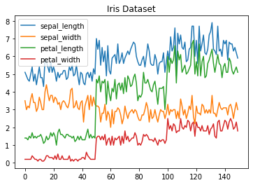
Line Chart
In Matplotlib we can create a line chart by calling the plot method. We can also plot multiple columns in one graph, by looping through the columns we want and plotting each column on the same axis.
# get columns to plot
columns = iris.columns.drop(['class'])
# create x data
x_data = range(0, iris.shape[0])
# create figure and axis
fig, ax = plt.subplots()
# plot each column
for column in columns:
    ax.plot(x_data, iris[column], label=column)
# set title and legend
ax.set_title('Iris Dataset')
ax.legend()
<matplotlib.legend.Legend at 0x1ec4b3274c0>

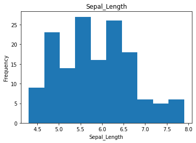
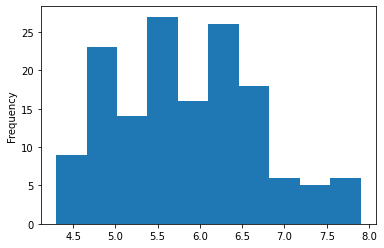
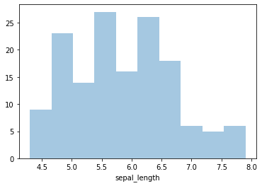
Histogram
In Matplotlib we can create a Histogram using the hist method. If we pass it categorical data like the points column from the wine-review dataset it will automatically calculate how often each class occurs.
# create figure and axis
fig, ax = plt.subplots()
# plot histogram
ax.hist(iris['sepal_length'])
# set title and labels
ax.set_title('Sepal_Length')
ax.set_xlabel('Sepal_Length')
ax.set_ylabel('Frequency')
Text(0, 0.5, 'Frequency')
Pandas Visualization
Pandas Visualization makes it really easy to create plots out of a pandas dataframe and series. It also has a higher level API than Matplotlib and therefore we need less code for the same results.
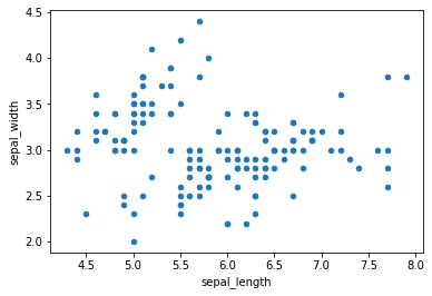
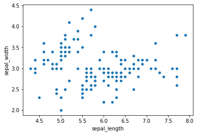
Scatter plot
iris.plot.scatter('sepal_length', 'sepal_width')
<matplotlib.axes._subplots.AxesSubplot at 0x1ec4b78dac0>
Line Chart
iris.drop(['class'], axis=1).plot.line(title='Iris Dataset')
# “axis 0” represents rows and “axis 1” represents columns.
<matplotlib.axes._subplots.AxesSubplot at 0x1ec4b7cdeb0>
Histogram
iris['sepal_length'].plot.hist()
<matplotlib.axes._subplots.AxesSubplot at 0x1ec4b857040>
to create multiple histogram
#The subplots argument specifies that we want a separate plot for each feature and the layout specifies the number of plots per row and column.

iris.plot.hist(subplots=True, layout=(2,2), figsize=(10, 10), bins=20)
array([[<matplotlib.axes._subplots.AxesSubplot object at 0x000001EC4B8D3E20>,
        <matplotlib.axes._subplots.AxesSubplot object at 0x000001EC4B31B280>],
       [<matplotlib.axes._subplots.AxesSubplot object at 0x000001EC4B6079A0>,
        <matplotlib.axes._subplots.AxesSubplot object at 0x000001EC4B7CD520>]],
      dtype=object)
![[Assets/DataVisualizationNotebook/output_19_1.png]]
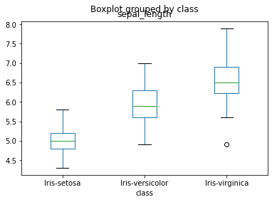
iris.boxplot(by ='class', column =['sepal_length'], grid = False)
<matplotlib.axes._subplots.AxesSubplot at 0x1ec4d20fb80>
Using Seaborn
Seaborn is a Python data visualization library based on Matplotlib. It provides a high-level interface for creating attractive graphs.
Seaborn has a lot to offer. You can create graphs in one line that would take you multiple tens of lines in Matplotlib. Its standard designs are awesome and it also has a nice interface for working with pandas dataframes.
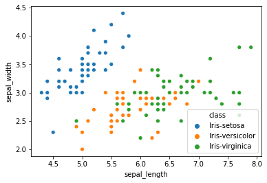
Seaborn has a scatter plot that shows relationship between x and y can be shown for different subsets of the data using the hue, size, and style parameters.
import seaborn as sns
sns.scatterplot(x='sepal_length', y='sepal_width', data=iris)
<matplotlib.axes._subplots.AxesSubplot at 0x1ec4b9b9d60>
sns.scatterplot('sepal_length', 'sepal_width', data=iris, hue='class')
<matplotlib.axes._subplots.AxesSubplot at 0x1ec4bdc4910>
sns.lineplot(data=iris.drop(['class'], axis=1))
<matplotlib.axes._subplots.AxesSubplot at 0x1ec4ce03220>
![[Assets/DataVisualizationNotebook/output_24_1.png]]
sns.distplot(iris['sepal_length'], bins=10, kde=False)
<matplotlib.axes._subplots.AxesSubplot at 0x1ec4ce9d760>
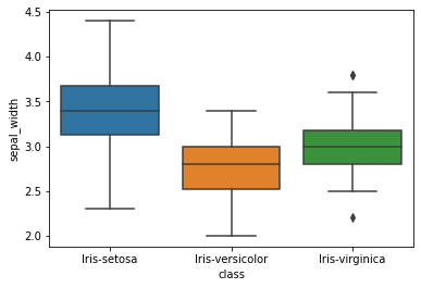
sns.boxplot(x = 'class', y = 'sepal_width', data = iris)
<matplotlib.axes._subplots.AxesSubplot at 0x1ec4d37cdf0>
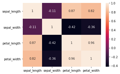
A Heatmap is a graphical representation of data where the individual values contained in a matrix are represented as colors. Heatmaps are perfect for exploring the correlation of features in a dataset.
sns.heatmap(iris.corr(), annot=True)
<matplotlib.axes._subplots.AxesSubplot at 0x1ec4d432b50>
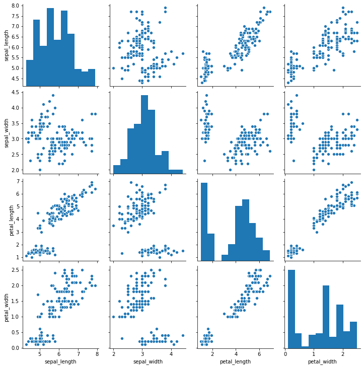
Seaborns pairplot enable you to plot a grid of pairwise relationships in a datas
sns.pairplot(iris)
<seaborn.axisgrid.PairGrid at 0x1ec4d50fcd0>
Tags: !AMLIndex